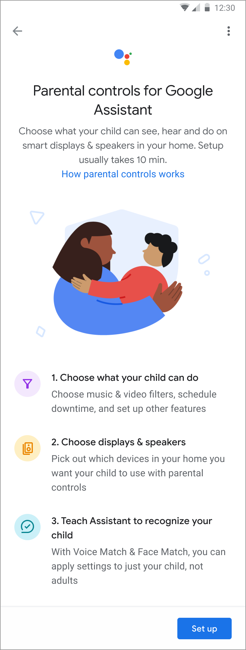
Parental Controls for Google Assistant
The Product gap between Assistant technologies and kids was huge. The Assistant for Kids (A4K) team had incredible kids features on the roadmap ahead, but before any of that can happen, we had to make sure that parents knew their kids were safe with Assistant. So, I was hired onto the team to lead the UX strategy and execution for the first ever Parental Controls feature on Assistant.
Role & Project Scope
I was brought in to lead the UX strategy and execution of Assistant’s first Parental Controls feature. The team consisted of Product, Engineering, Privacy & Legal counsel, and User Research. I collaborated also with the YouTube Kids team, and Google’s Unicorn team as there were multiple integrations required (entry points, integrations, etc). It was a large scale project, due to the sheer number of moving parts, and parallel workstreams. The goal was to launch the MVP of Parental Controls in time for a large media campaign around Google’s investment in kids.
Defining Requirements
We wanted the MVP of Parental Controls to feel comprehensive. We did an audit of all children-directed features and settings, and applied AADC guidelines to determine the right default settings for each. Out of the box, it had to be safe for kids, and the cherry on top would be allowing parents to set even stricter, or looser parameters based on their preferences.
A mobile-first experience

The primary entry points for this feature are on mobile, notably the Google Home App, Assistant App, and Family Link App. There were also entry points from Smart Speakers, and Smart Displays, but we ultimately always lead the user to a Mobile App surface. Due to the highly sensitive nature of digital safety for kids, we felt it was most responsible to leverage the Mobile surface for these settings.
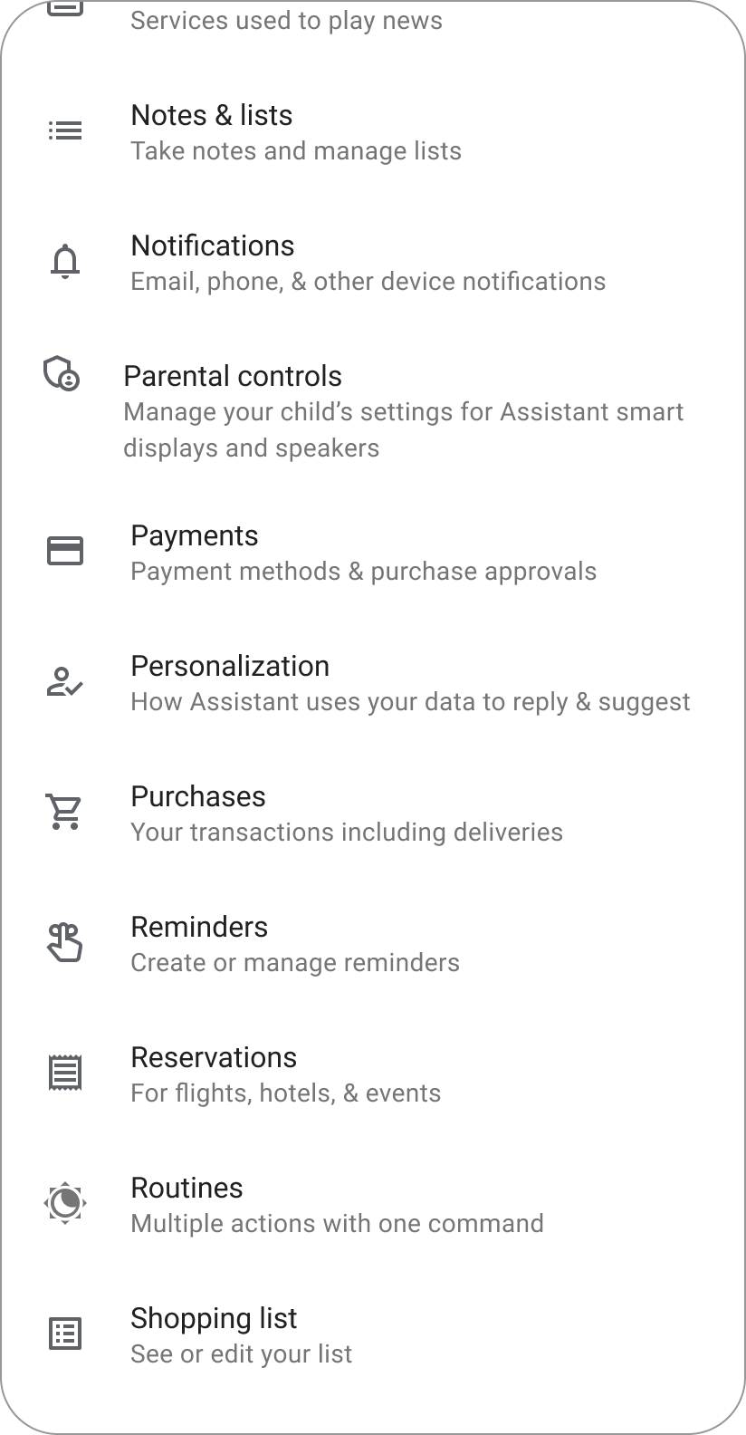
Parental Controls is now a new setting that can be found on the Google Home App.
Smart Speaker & Smart Displays
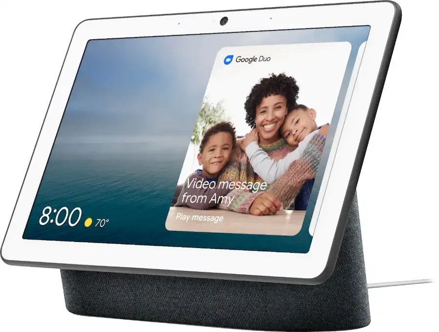
User journeys can often include more than one surface. Here is an example of re-directing users to complete their user journey on Mobile. The Smart Display is a larger touch surface but has limited capabilities and can feel cumbersome for detailed tasks.
This is the re-direction page I designed:
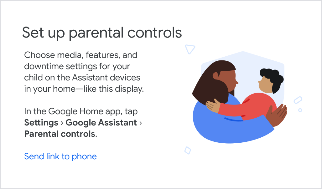
This is the feature announcement card for Smart Displays, a common entry point for Parents as their child(ren) interact with the Assistant in communal spaces. A link to the setup process can be sent to their phone.
Introducing the Feature
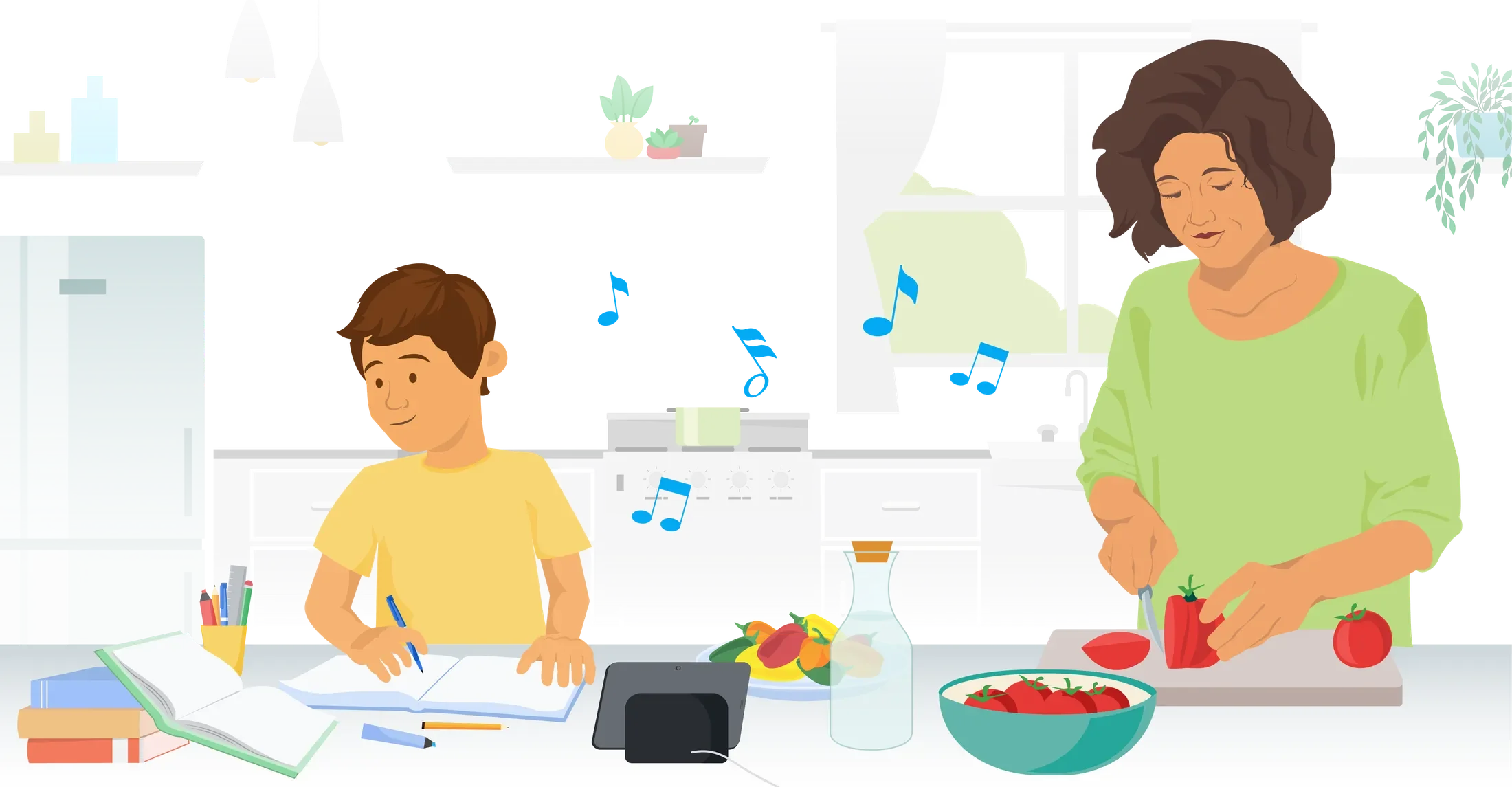
Parents have been giving us feedback about wanting Parental Controls for Assistant, because from the young age of 3, their children have already been using Smart Speakers and Smart Displays in common areas.
We were concerned about long set up times, but the UXR revealed that parents did not mind the time investment if it meant their kids can have a better experience on the Assistant.
We also learned from UXR that long set up flows are aided by an Overview that sets expectations from the start, such as how long it would take, and whether their child should be around too. That way they’re not caught off guard mid-flow that their child isn’t Voice Matched.
Reviewing the default settings
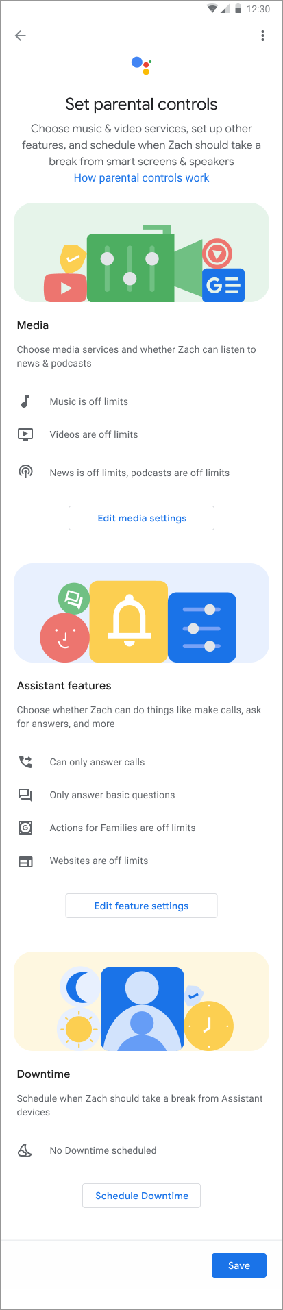
If we know the user is a Unicorn (what we call a child at Google), there are default settings that we have to apply so that the experience is safe out of the box without parental intervention.
The primary goal of the Parental Controls experience was to make sure parents knew what these default settings were, and to easily change them to suit their preferences and the child’s. We knew from UXR that parents would not want to change most of these settings (most only 1-3) so we decided to go with a scannable review page, with deeper flows (i.e. progressive) for when they want to change a setting.
There are 3 main sections that we divided the various settings into 1) Media 2) Assistant features 3) Downtime
I wanted the page to feel scannable, so I used images to demarcate where one section ended and another begun. This tested very well in UXR, and was preferred over going through each grouped setting one by one, which felt longer and more tedious to the users we tested with.
Changing Media settings
This is an example of what the parent would see when they decide to change a setting under Media. The same page layout and format is used for Music, Video, and News & Podcasts. In UX, the content strategy and writing was the most reviewed with Legal counsel. The wording had to be clear, non-misleading, and neutral. Parents also had access to Help Center articles for further detail and clarification.
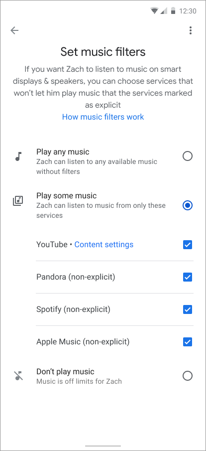
The user has selected to Play some music. 3rd party music apps are selected by default, with clear copy ‘non-explicit’.
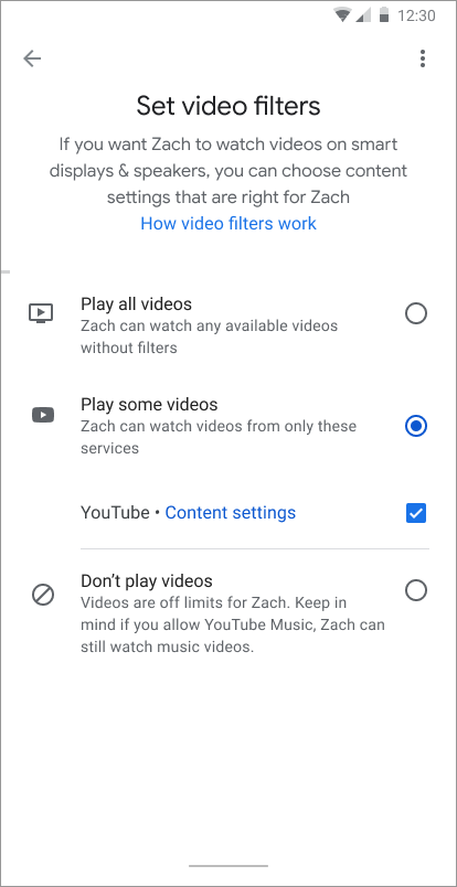
Here the user has no other video app services on their device other than YouTube. Separate content settings can be access from the provided link.
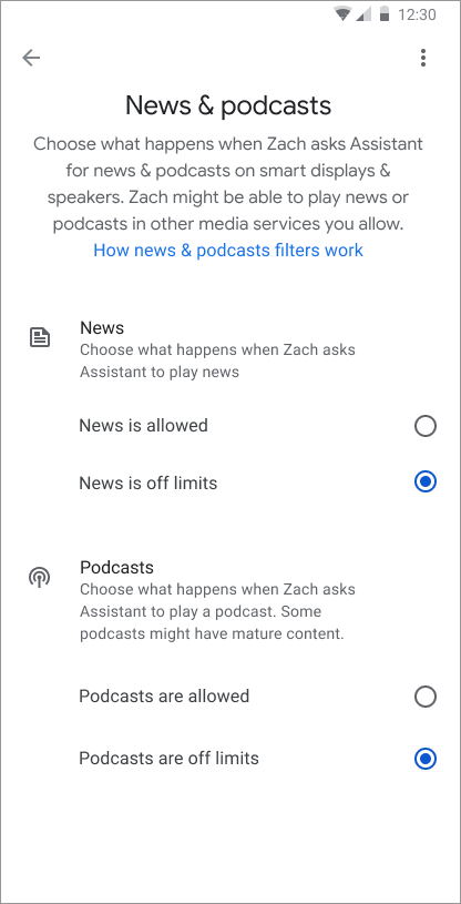
By default, News & Podcasts are off limits. Through UXR we learned parents would likely not change these settings.
Changing Downtime Settings
Downtime has been a feature available for parents to use before Parental Controls. It is a highly valued feature, allowing parents to turn off access to Assistant enabled devices for a period of time. We integrated the existing framework for Downtime, so settings can be changed in the Parental Controls setup.
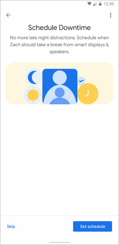
Set-up intro screen provides the user with some context
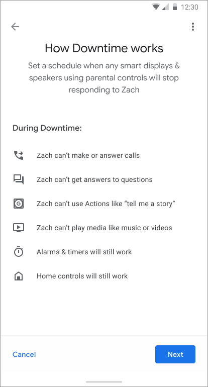
Downtime settings overview so parents know what the setting affects
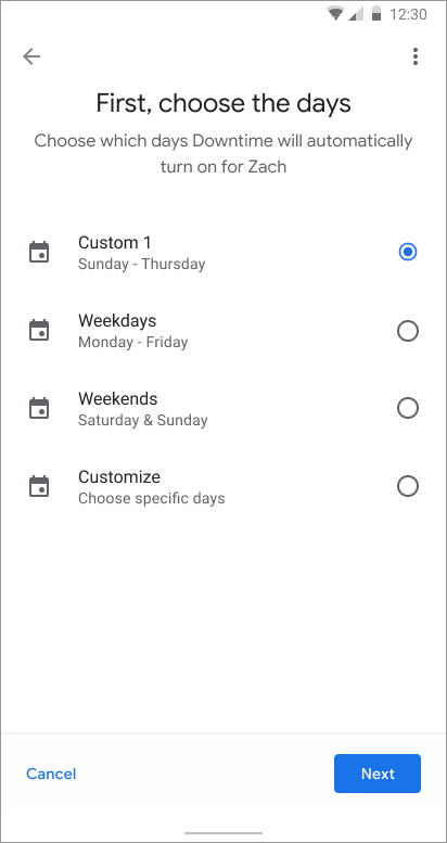
Parents can select pre-filled options, or create a custom schedule
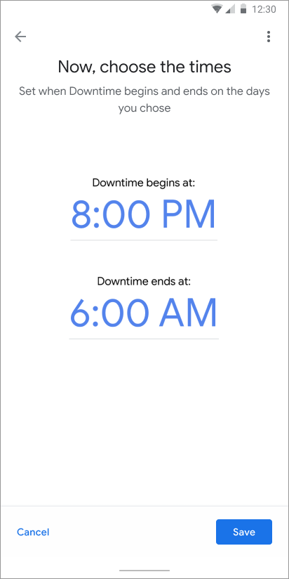
Time selector for scheduling
Confirmation state
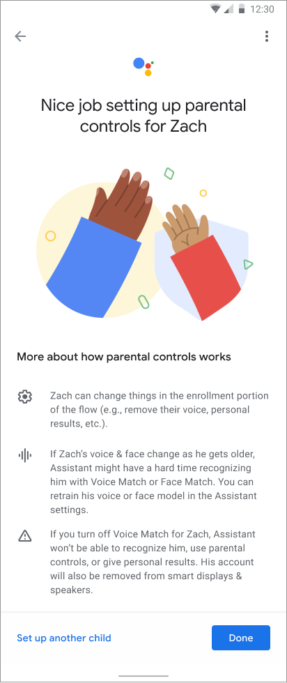
I wanted the confirmation state to feel celebratory and summative. The Parent user has just taken a big step making the Assistant the best experience for their child’s specific needs and desires, and it deserved recognition!
It was also important to communicate new information here as well, such as what would happen as the child gets older, and the Voice & Face match may no longer work.
There is also an advisory alert that turning off Voice Match would mean the Assistant cannot recognize the child anymore, and parental controls would no longer apply.
Given that many families have more than 1 child, we also wanted to provide a link to set up parental controls for additional children.
Communicating user flows
A large part of this project’s success was having clear user flow journeys for stakeholders to review and provide feedback on. It was imperative that Product, Legal & Engineering were all aligned on which entry points would lead to which flows, and how the journeys would change based on the entry points. The documentation was truly imperative for the success of this project.
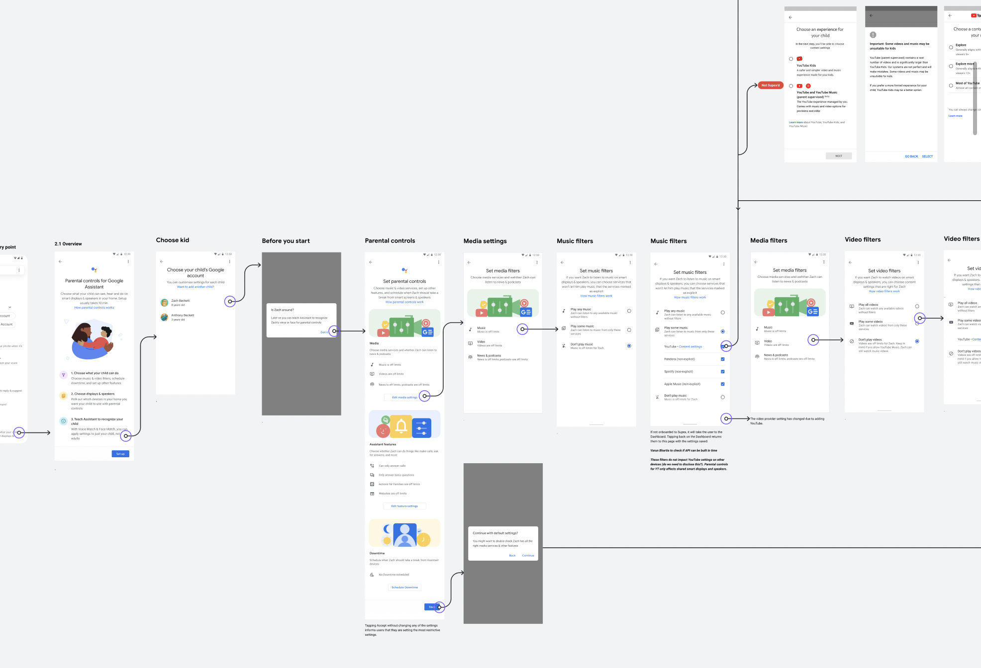
A small sample of one user journey flow from the Google Home App entry point, where the child has already been added to the Google Home.
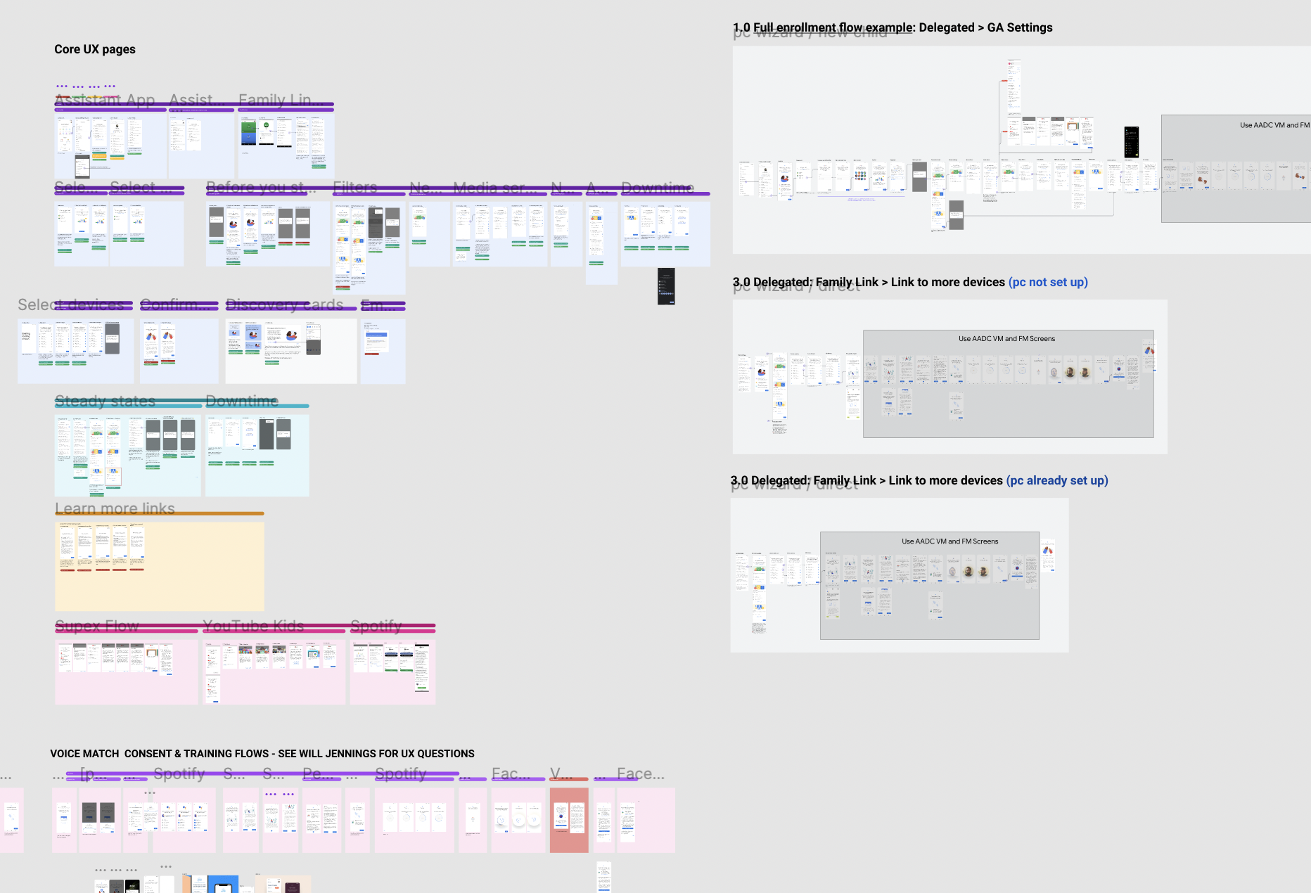
A screenshot of my Figma file (while WIP). It can get overwhelming at times, but clear labelling and using colours can help orient team members as they’re reviewing designs. Stakeholders outside the immediate team would receive presentation decks to illustrate the flows.
Challenges
The enormity of scope coupled with the seemingly never-ended list of open-ended legal discussions was likely the largest challenges I faced on this project. Many meetings with various stakeholders, and external teams were needed to iron out the fine details of the requirements, and we were also dependent on designers from other teams to help integrate other user journeys into this experience. To help create some structure and order to the madness, I proposed several solutions to our Program Manager to help track legal reviews and open items, external team dependencies, and bottle necks that needed to be cleared.
My team told me that before I joined, the project seemed to go in circles, and clarity was hard to obtain. I felt an immense sense of pride to be able to help finally launch this feature, and bring a lot of clarity for the team.
Outcomes
Once Parental Controls launched, it paved the way for more Kid friendly features to be added to the Assistant, as there was now a way for parents to enable/disable and set preferences for them. It was immensely gratifying to see a very positive reception in the Media (CNET, Wired), and to create a solution to a very real user problem.