• Portfolio
  • Writing
  • About

Christine Ko

  • Portfolio
  • Writing
  • About

Designing for an AI-First Future: How UX Is Evolving — and How I Approach It

AI is rapidly reshaping how digital products are built, scaled, and experienced. For UX designers, this shift isn’t about learning new tools in isolation. It’s about rethinking our role in systems that are increasingly adaptive, predictive, and autonomous.

This is how I think about the future of AI in UX design, and how it informs my work.

AI Changes the Medium, Not the Mission

The core goal of UX hasn’t changed: helping people accomplish what they need to do with clarity and confidence.

What has changed is the medium.

AI introduces interfaces that adapt in real time, systems that make decisions on behalf of users, and experiences that evolve continuously rather than ship in static states.

My role as a designer is not to design the AI itself, but to design how intelligence shows up in a way that feels trustworthy, legible, and humane.

From Static Interfaces to Living Systems

Traditional UX design assumes relatively fixed flows. AI-driven products do not.

I approach AI-powered UX as system design, focusing on boundaries (what the system should and should not do), confidence levels (when the system acts automatically versus asking for confirmation), and fallback states (what happens when predictions are wrong).

Good AI UX doesn’t feel magical. It feels predictable in the right ways.

Personalization Requires Restraint, Not Just Capability

AI enables hyper-personalized experiences, but more personalization is not always better UX.

My design lens prioritizes user control over personalization, transparency over surprise, and progressive trust-building rather than instant automation.

An interface that adapts too aggressively can feel invasive or manipulative. A well-designed one earns trust gradually.

Designing for Understanding, Not Just Efficiency

AI systems often optimize for speed and accuracy. UX must optimize for comprehension.

That means making system intent visible, explaining why something is suggested or automated, and designing affordances that support learning rather than dependency.

The best AI-powered experiences leave users feeling more capable, not replaced.

Ethics Is a Design Problem, Not a Policy Problem

Bias, privacy, and misuse aren’t abstract AI concerns. They surface directly in UX decisions.

I treat ethics as a first-class design constraint through how defaults are chosen, what data is requested (and what isn’t), and how reversible decisions are.

Designers sit at the intersection of technical capability and human impact. That responsibility is part of the job.

How AI Changes the Designer’s Skill Set

AI shifts designers away from production-heavy tasks and toward higher-leverage work.

The skills that matter most going forward include systems thinking, strong product judgment, clear communication with engineers and stakeholders, and the ability to reason about edge cases, failure modes, and unintended consequences.

AI doesn’t reduce the need for senior designers. It raises the bar.

What I Bring to AI-Adjacent UX Work

When working on AI-powered or AI-adjacent products, I focus on making complex systems feel understandable, designing calm and respectful experiences around uncertainty, balancing business goals with user trust, and asking hard questions early before patterns are locked in.

The future of UX isn’t about designing smarter machines. It’s about designing experiences that help people feel grounded, capable, and respected in the presence of intelligence.

Closing Thought

AI will continue to accelerate. Tools will change. Interfaces will evolve.

Products that succeed long-term will be the ones where intelligence is felt, not flaunted; power is paired with restraint; and design decisions reflect empathy as much as optimization.

That’s the kind of UX I aim to build.

Monday 02.02.26
Posted by Christine Ko
 

Red Routes 101

London-England-street-red-bus-road-city_1600x900.jpg

I've never been to London England before. Sure, there's a London in Ontario, but it's certainly not as large, or glamorous (though it is very quaint!). When I picture London, I see a mass of people crowded in the Tube, or jam packed in their cars on their way to work. Interestingly, in London, there are roads called Red Routes, which have painted red lines on them that distinguish them as 'critical' roads that must be kept clear at all times in order for transport to function decently. You can think of them kind of like the main arteries in your body - crucial delivery paths that transport much needed resources throughout your body.

Applying the London example, user experience designers utilize something called the Red Route method when designing websites and applications. Rather than trying to accomplish everything, critical 'Red Routes' are identified, and delivered as the 'main arteries of the website'. They represent the key functions that the user, and the business owner want to accomplish.

So why do designers use Red Routes exactly? Here are some reasons:

Reason #1: A Red Route approach allows you to avoid the problem of trying to understand everything that everyone wants to do, by focusing on the most important scenarios enacted by the key Personas. Just like in London, Red Routes established for websites and applications allow the design team to keep focus on the critical user tasks at hand.

Reason #2: A Red Route approach involves creating a map of the user's path to a goal, which in hand shows us where to look for roadblocks along the way. Gaps and issues can be quickly located to specific Red Routes, whereby they can then be resolved.

Reason #3:  if you don't focus on red routes, you run of the risk of causing issues with the site's Information Architecture. Each page you add on to the website requires more navigation links, which leads to more 'noise' in the site's navigation, making it more difficult for users to find the content they need. Simply put, less is more. Crucial features only please :)

Reason #4, if you don't focus on red routes, site maintenance increases.

There are many ways you can identify the Red Routes of your application and website. For example, you can examine competitor sites, use a survey, identify frequent tasks, identify critical tasks, and ask users to pick their top 5 tasks. Essentially, when picking red routes, ensure that most or all of the people will be taking them, most or all of the time.

Case Example: Red Routes for a university website:

  • What subjects are available to study at the university?
  • How much is annual tuition for a domestic/international student?
  • Where is the location of the campus?
  • Are part-time studies an option?
  • What are the admission requirements for each program?

Importantly, people approach tasks differently based on the context of use. A student, professor, and school administrator will carry out tasks on a School website differently from each other. Thus, we have to understand the context. Context is built into tasks with user stories, which are based on a specific Persona.

For example, one red route on a Health application may be "Manage my eczema". Here is a user story of Anna. Anna says, "As someone with eczema, I want to track my skin condition on the computer so I can find out any specific periods of the day, month or year where my skin is most troubled".

Once you have your user stories, it's always a good idea to test them to ensure they are sound and accurate. Here are some questions you can ask to test your user story:

1. Is it really a red route?

2. Is it specific and measurable?

3. Does it describe a complete activity?

4. Does it describe what the user wants to do (not how it's done)?

So before designing any website or application, keep in mind what the red routes are that capture your users' key goals when using your app.


tags: user experience
Sunday 04.16.17
Posted by Christine Ko
Comments: 1
 

UX Must-Read Books for Beginners

Knowledge is power, and when I was getting my mind wrapped around UX, I would've been lost without these guiding posts to help me along the way. In no particular order, these are, in my opinion, critical design books that help form a solid foundation of knowledge that every UX Designer should read:

The Elements of User Experience by Jesse James Garrett

About Face 3: The Essentials of Interaction Design by Alan Cooper

Universal Principles of Design by William Lidwell

Universal Methods of Design by Bruce Hanington

Communicating Design by Dan M. Brown

The Design of Everyday Things by Don Norman

Don't Make Me Think by Steve Krug

tags: Learning, UX, Books, Reading
Thursday 04.13.17
Posted by Christine Ko
Comments: 1
 

Selling Usability

usability.jpg

As an aspiring user-experience champion, I need to learn to sell to the business why it's important to invest time and money in increasing the usability of our products.

So, why is usability important? Why are we all so obsessed with improving usability? Well, on the business side, improved usability actually helps with...well, business!

  • When customers are able to use your website and, for example, find the products they want, it increases revenue.
  • Reduced need for remote help support = cost savings.
  • People will actually pay a premium for a product/service that is easier to use.

On the development side of things, improved usability allows the team to:

  • Spend time developing only the functions customers want.
  • Detect and fix usability problems early on in the process.
  • Reduce the risk of failure caused by not understanding requirements.
  • Minimize or eliminate need for documentation.

If we can create a sort of 'elevator pitch' of the importance of user-centered design, we really come one step closer to our goals. So, if the VP of Technology asks you why they should approve your budget for more usability testing, what would your 'elevator pitch' be?


tags: usability
Saturday 10.08.16
Posted by Christine Ko
 

How to Measure "User Experience"

metrics.png

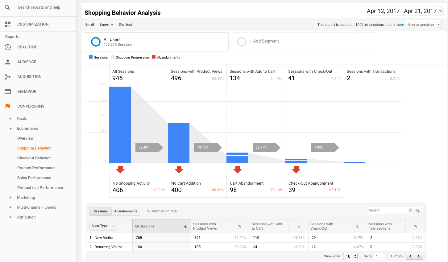
At the end of a long day of working on a customer's website or application, how can we tell if we are achieving our goals? Sure, a site can look great, and have impressive functions, but until we measure whether they are accomplishing business objectives, we won't know whether it is a job well done!

In the book "The Lean Startup" by Eric Ries, the author encourages the continual measurement of the product with customers. In order to do this, you must identify hypotheses and carry out "experiments" to test them out (as early as possible). The business objective is essentially a key metric (or KPI) that the experiments are designed to measure. The hypotheses are based on research, surveys, etc. and are outcomes believed to lead to the successful achievement of the business objective.

So, how do we begin this journey of measuring user experience?

Step 1: Document the key business objectives and validate these with stakeholders. What does the business hope to achieve with the website?

Step 2: Identify the UX attributes that you think are critical to achieving the business objective. UX attributes can be found by use of research, surveys, examining competitor sites, etc.

Step 3: Identify activities and design work that can be done to improve the UX attributes. The International Standard of Usability defines usability as "the extent to which a product can be used by specified users to achieve specified goals with effectiveness, efficiency and satisfaction in a specified context of use".

1. Effectiveness: can the user achieve specified goals? To measure effectiveness, you can look at:

  • Success rate - % of users who correctly and completely achieve the goal unassisted.
  • Disaster rate - % of users who think they were successful but failed.
  • Number of errors per unit of time.
  • % of tasks completed successfully on first try.
  • Number of requests for assistance accomplishing task.
  • Objective measure of quality of output.

2. Efficiency: How much work was required for the user to achieve specified goals?

  • The average time taken to complete each task.
  • Time taken on first attempt.
  • Time spent relearning functions.
  • Time to perform task compared to an expert.
  • Time to achieve expert performance.
  • Number of clicks taken to achieve task.
  • Time correcting errors.
  • % of time using manual.

3. Satisfaction: How does the user feel about the website or application, and their experience with it?

  • Mean score using an established questionnaire.
  • Ratio of + to - adjectives used to describe the website.
  • % of customers who would recommend it to a friend.
  • Customer rating of quality of output.
  • % of customers that rate the website "easier to use" than a competitor's.

Step 4: Measure the benchmark state of each UX attribute and define it as unacceptable, minimum or on target.

Step 5: Track changes in each UX attribute until target values are achieved.

Step 6: Implement the change and test if the business objective is being met. A common test is "AB Testing" whereby random users are assigned and asked to use Site A or Site B. The Version B site will have one major change implemented (the one that is tested). If the business objectives were met more successfully with Version B, then you know that change should be implemented.

It's really important to continually measure 'user experience' before and after launching a website or application. Although it may look good to you, until you can prove to the business that it's accomplishing their goals, and unless you can satisfy the users who are on them, usability has not yet been achieved.

Saturday 06.04.16
Posted by Christine Ko
 

Usability Testing for Beginners

usability-testing-hero.png

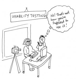
Usability testing is absolutely critical to user-centered iterative design. The process of conducting usability testing is very straightforward, though there may be required some practise before perfecting that poker face ;)

Step 1: Give Instructions to the user.

  • Let them know that they are to "think out loud" when carrying out the defined tasks (which should include red routes/critical tasks).
  • Explain to them that your role is to communicate what you do and say to the software developers.
  • Let them know that you won't be able to explain or answer any of their questions, but for them to feel free to ask them anyway. Tell them it's because you want to create the most realistic situation possible

Step 2: Demonstrate and let them practise.

  • Start by demonstrating what 'think aloud' should sound like. Show them how you would turn your phone to silent.
  • Then, ask them to 'think aloud' with a simple task, such as adding a new contact on their phone, or adjusting something in the room.
  • If they are not able to think aloud to the level required, do not proceed until they get it right.

Step 3: Probe with open questions.

When they are talking, or asking questions, probe! But don't answer or provide any bias in your response. "Keep talking"; "Tell me more"; "What are you thinking right now"? Are good questions.

  • User: "That was Easy!". You: "What was easy?"
  • User: "Is that how it's supposed to work?". You: "Is that how you expected it to work?"
  • Focus on the present. Instead of "Is this a useful feature?", ask, "Would this feature, as it is currently presented, be valuable to the way you choose products today?"
  • Focus on specifics. Instead of "Is this a good idea?", ask, "was there anything you particularly liked or disliked about the prototype? What specifically?"
  • Don't be judgmental. Instead of "Don't you think this option would be better if it was available on the home page?", ask, "Is there any other place you'd like to see a feature like this?"
  • Don't encourage confabulation. Instead of "You seem surprised, were you?", ask, "was that what you expected?" or "what did you expect"?

And very importantly,

Keep your poker face on!!

Watch this hilarious video about keeping the poker face on that will demonstrate the difficulty of doing so :)

Saturday 05.14.16
Posted by Christine Ko
 

The Three Secrets of User-Centered Design

ux design.png

I read this wonderful little tale written by Dr. Davis Travis called: The Fable of the User-Centered Designer. It's a really quick read, so I was able to summarize the points quite succinctly. In a nutshell, here are the Three Secrets to User-Centered Design:

1. Early and continual focus on users and their tasks.

  • Identify the users of our systems and what they want to do with it. Create user profiles/personas and ensure the design team understands who they are designing for. No assumptions should be made; all knowledge utilized here derive from observations and research findings.
  • Conduct regular in-person site visits with customers to understand what motivates them (their goals), and the environment in which they use the product.
  • Develop red routes: critical tasks that people need to carry out as smoothly and quickly as possible. Developing red routes ensure less important functions don't clutter the interface.

2. Empirical measurement of user behaviour.

  • Conduct usability testing. Ask customers to carry out critical tasks on the application and to think aloud while doing so. Take on the role of 'apprentice' and ensure they understand we are here to watch how they navigate and experience the application, not to test them.
  • Measure usability effectiveness (how many people manage to complete red route successfully), efficiency (how long did it take for them to complete the task), and satisfaction (how do they feel about the design).

3. Iterative Design.

  • In the iterative design mindset, we want to put off writing code for as long as possible. Not that we're avoiding it, but rather, that we understand fixing or re-writing code to requirements is far more costly and time consuming than doing it right the first time around.
  • In iterative design, paper prototyping is an invaluable method to quickly sketch lots of designs, and test them. Design, test, re-design, and re-test. That is the iterative method. The best elements of each design are found, tested, and then applied; the goal being: refining the design to get it just right.
  • The goal of paper prototyping is to ensure we get the correct Information Architecture, so people can navigate the site and understand the terminology.
  • Electronic prototyping then helps us ensure we get the correct visual design of the application or website.
  • In an ideal world, we can conduct user testing for every iteration; however, in reality, try to involve users whenever important design decisions are going to be made.
tags: user experience
Thursday 03.19.15
Posted by Christine Ko
 

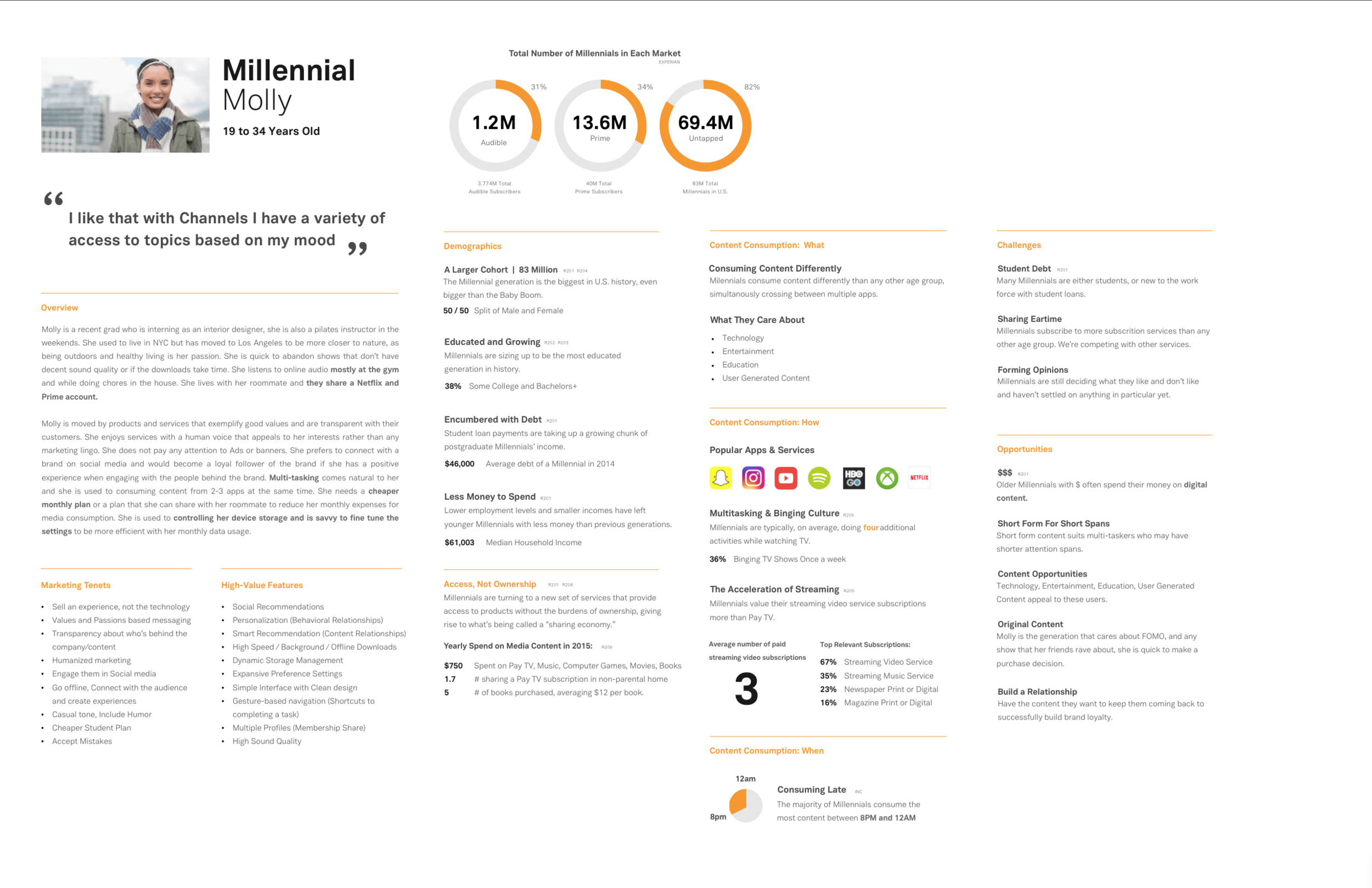
Introducing Personas

A key process in user-centered design is to...well, understand the user! Rather than basing our understanding on past experiences, assumptions, stories shared, etc., designers spend some time developing "Personas".

What are Personas? In a nutshell, Personas describe customer archetypes that bring the user to life. They are short, engaging summaries of the key customer groups, that place the emphasis on specific users.

Molly.png

Why use Personas? Sometimes, we wish that we could just please everybody (at least I know I do). That there exists out there one magic bullet that proves our conviction that there is such a possible way to design "the perfect product for every user". The hard truth and reality is, though, is that the key to failure truly is trying to please everybody. That when we design with this goal in mind, we often produce something that really becomes useless to everybody, and serves no clear purpose in the end. By focusing on key users and their goals, Personas limit our choices, and thus help us make better design decisions.

How do we get Personas? Personas must absolutely be based on research. Customer or user interviews and observation are the backbone of Personas; not surveys or anecdotal evidence. When interviewing users, you will start to see a pattern forming, that one user resembles another, and yet another. When you start seeing the consistent overlap, you can at that point decide to discontinue the interview process (anywhere between 18-25 interviews may be required to reach this point) to yield 4 Personas (for example).

There is a Primary Persona that must be selected as the main focus of the development effort. After satisfying the Primary Persona, the designer can then focus on the needs of secondary and tertiary Personas, in an effort to accommodate the needs of other users. Importantly, due to this fact, it is crucial not to have too many Personas, as the design team can then be easily overwhelmed, side-tracked, and lose focus on the task at hand. I would aim for in or around 4 Personas.

Important differences that should be made evident when determining Personas are what people do (behaviour) and why they do them (goals and motivations). Demographics should not be the focus here, though they may influence elements of visual design (for example, targeting female shoppers to a jewellery website).

Some elements of a Persona can include:

  • User name
  • User's photograph
  • A quote from the user that captures their key objective
  • A short narrative describing the user
  • A list of key goals of the user

When I think of Personas, I imagine these life-sized cutouts of ordinary people, from various stages, and walks of life. I imagine them with background stories, jobs, a family. I see that they may have frustrations, challenges, and are motivated to succeed. When placed literally in front of a design team, they serve as a critical reminder to always stay user-focused, and to empathize with the genuine needs of the users. They allow designers to relate to the user as a real person, and make accurate judgments on how a design element would help or not help Jane Doe achieve or not achieve her primary goal.

There is some current debate (as is always the case in UX design) on the real value that Personas create, and whether they are truly necessary to make a material difference to the bottom line. It would be interesting to see what other viewpoints are out there! Please feel free to share :)


tags: persona
Saturday 02.21.15
Posted by Christine Ko
 

Context: an integral examination of user behaviour

DaividFetterman_Quote.jpg

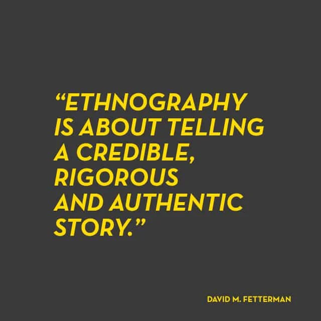
The first step before we can even begin thinking about designing for the user, is to understand and research the context in which users will be interacting with the application or website. We often think we can make assumptions about what it's like to be a nurse, or a fork-lift operator, but unless we did these jobs ourselves, we can't really assume we know much about them at all. Usability is all about the context of use - how does the user see things, what do they know, what do they want, and how do they work?

There is a technique called "Contextual Inquiry" that can assist you in finding out what this 'context' is. There are 4 steps to a contextual inquiry:

Step 1: Context - Go to the user's home or work environment to understand the context of the user's actions. Ask good questions! Make sure they are open-ended and have wide-range. Also, take photographs and sketches of the environment (yes, this includes the office space itself, and importantly, the participant interacting with other people and objects).*

Step 2: Partnership - Discourage the participant from seeing you as the 'expert' or the 'interviewer'; rather, take on the apprenticeship role, and treat the user as the expert, and you as someone trying to learn their job.

Step 3: Interpretation - Ensure you go through your findings with the participant to verify that your interpretations and subsequent conclusions are accurate. Ensure to record the session to capture intonation as this will be central to your analysis. If possible, transcribe the session.

Step 4: Focus - Create a 'Hunt Statement' with the development team before you venture out. Capture the focus in an observation guide to prevent you getting side-tracked on your site visit. Ask all the members of the project to jot down one burning question they wish to ask the user on a post-it note. Group the questions in sections, and ask everyone to vote for the most important section. From this, articulate the focus question and create a statement: "I am going to research [activity]  so that I can [design a system]".

*Quick side note on how to take great notes!The AEIOU system: Activities, Environments, Interactions, Objects, and Users.
"Affinity sorting workshops" are where you and your team share and agree on what you saw. What you want to be able to understand afterward is:

  • Mental models people build
  • The tools they use
  • The terminology they use to describe what they do
  • The workflow
  • The underlying goals that people have
  • People's underlying values

If you absolutely cannot conduct on-site observations, there are other options:

  • Diary Study: ask them to record their thoughts, experiences, and impressions around the topic.
  • Critical Incidents: ask users to write down waht they were doing 5 minutes before and after a critical incident.
  • Photo-ethnography: ask users to photo-document a workday, weekend or leisure day.
  • Remote desktop: ask users to share their screen with you and talk through the way they work.
tags: user research
Tuesday 01.13.15
Posted by Christine Ko
 

Let's talk dialogue boxes.

dialog box.jpg

Dialogue boxes. We all hate them. They tell us we did something wrong. Or that the system has messed up in some way but that the computer is working to get the problem fixed. Or that something has been 'saved successfully'. Sometimes, they even tell us the world is ending.

Dialogue boxes make the user feel frustrated, as it interrupts their 'flow'. Often times, they are unnecessary, and only accomplish the task of making one feel incompetent, dumb, or worse yet, utterly and completely helplesss.

Thinking long and hard whether a dialogue box is truly needed, whether it really helps the user accomplish their goals, is an important step when designing applications. When doing so, please keep in mind that:

1. Asking questions is frustrating to the user. For example, asking, "are you sure?", causes the user to feel doubted by the machine, which is ludicrous! We should always feel smarter than the machine in front of us, we should feel they are working for us, not against us, and that they are making our lives easier, not more complicated.

2. Present the user with choices instead. This gives them empowerment to control what happens. If one of the choices is going to make permanent, drastic changes to an application, then it's definitely a good idea to present that information before the change is confirmed. Otherwise, it's likely not necessary, and considered a bother.


tags: user experience
Saturday 01.03.15
Posted by Christine Ko
 

Top 10 Keyboard Shortcuts in Omnigraffle

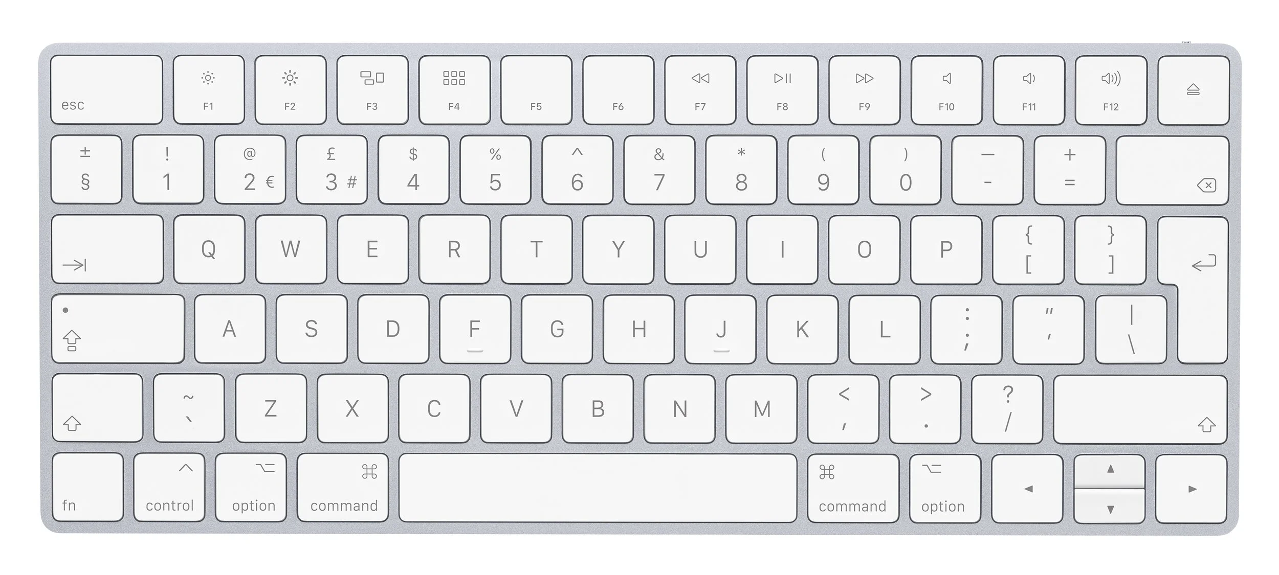
This post is written for anyone who would like to learn the top 10 (and easiest) keyboard shortcuts that will help you wireframe much more efficiently in Omnigraffle. This post is designed for those already familiar with or using Omnigraffle. Note: When there are 3 or more keys, always hit Shift first, then Command, then the key.

keyboard.jpeg

1. Close Window (Command + W)
Best used when: You would like to exit a Link Back or Omnigraffle application quickly. Note: Omnigraffle auto-saves your progress.

2. Alternate Between Open Windows (Command + tilde)
Best used when: You have several Link Backs or several omnigraffle documents open and you'd like to toggle between them.

3. Group objects in a layer (Shift + Command + G)
Best used when: You would like to easily select and move around related elements without needing to select them individually.

4. Ungroup objects in a layer (Shift + Command + U)
Best used when: You would like to easily ungroup related elements so you can manipulate them individually.

5. Bring object to front (Shift + Command + F)
Best used when: You would like an object to be the top most layer on the canvas. All other objects will appear behind it.

6. Bring object to back (Shift + Command + B)
Best used when: You would like an object to be the bottom most layer on the canvas. All other objects will appear in front of it.

7. Paste and Match Style (Shift + Opt + Command + V)
Best used when: You would like to paste text but match the style of where you're pasting to.
How to: Select the text you'd like to copy over, and press Command + C (copy). Go to where you'd like to paste it to, and use the shortcut to copy over that content but with the same style as what's being edited.

8. Copy and Paste in Place (Shift + Command + V)
Best used when: You would like to copy an object from one canvas to another in the exact same place. Very useful by taking the guesswork out of consistent placement of objects across canvases.

9. Format Tool (W + Opt)
Best used when: You would like to copy the style of an object to several others with minimal work.
How to: Click W + Alt/Option and hold it down while selecting the object you'd like to copy the style for. Once selected, release all keys. Find the object you'd like to apply the style to, hold down W key, and click the object. Repeat for as many objects as you wish.

10. Disable Smart Snapping Temporarily (Control + Command)
Best used when: You would like to have full control when changing object sizes, without having to disable Smart Alignment and Smart Distance Guides.
Note: Snap to Grid must be turned off for this shortcut to work.
How to: Click to transform the object as you normally would. Before you start dragging, click and hold Control + Command, and then drag the object to transform.

tags: tips, omnigraffle
Monday 12.29.14
Posted by Christine Ko
 

© 2026 Christine Ko