Manager Performance Tool
Leaders across an organization spanning hundreds of thousands of employees are grappling with the challenge of managing teams effectively and ensuring low attrition and productivity rates. This brief examines the re-design of a powerful internal web application that allows these leaders to collect real-time data on how they are performing as leaders in a global organization.
Due to confidentiality reasons, certain details are omitted.
Role
I was the Lead UX Designer, solely responsible for supporting the end-to-end experience of the Manager Performance Tool, facilitating consensus, collaboration, and key decision making among stakeholders, Product Managers, Engineers, and Data Scientists.
Project Details
The product was at a cross-roads. Usage and adoption were high, but there were many unfulfilled user needs that were causing frustration throughout the organization. For 8 months, we surfaced the goals, needs and pain points of our end users, and delivered a high fidelity concept that illustrated our plans for the future roadmap.
Impact
700k+ employees are directly impacted by this internal web application, as managers across a global Fortune 50 company rely on it to find signals, and improve their leadership.
Data-driven performance tracking
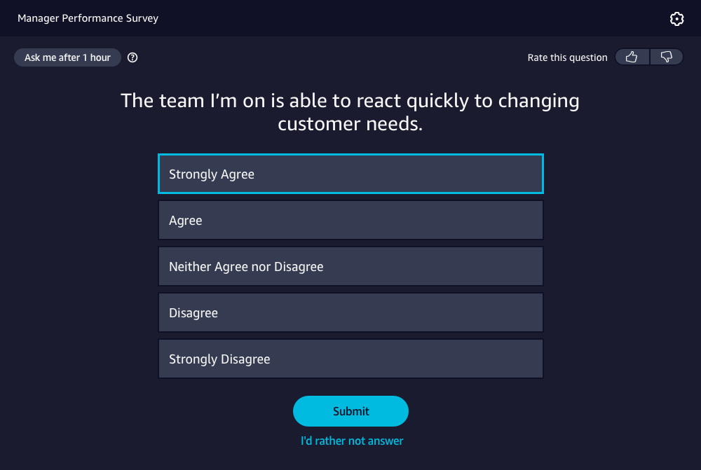
Every employed individual across this global organization receives 1 survey question a day, designed by psychologists and researchers to understand an employees’ sentiment on a specific topic or range of topics, related to their manager’s performance, and team/org health in a given time period.
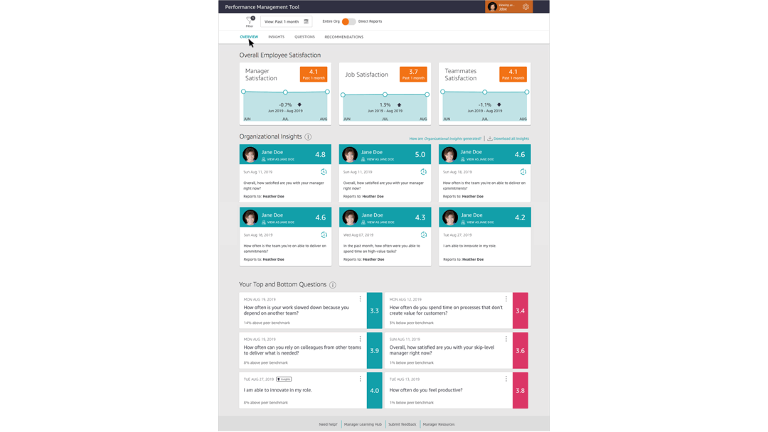
Meaningful data in a powerful reporting tool
Leaders across this organization are given the added opportunity to view the results of these questions so that they can take steps to improve the health of their organizations. Leaders view results data, trends, and receive recommendations.
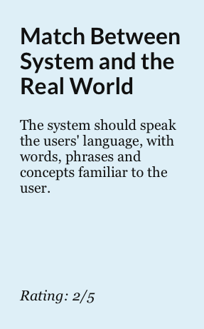
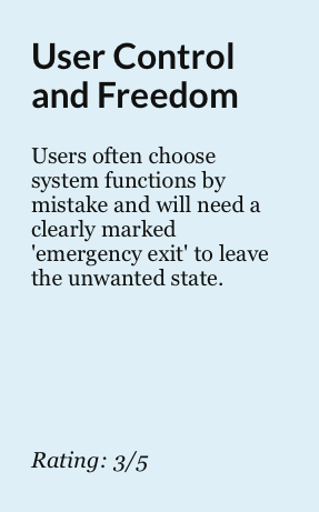
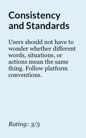
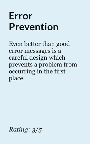
A heuristic evaluation
The product has moved past its MVP stages, and has been well entrenched in the organization for a few years now, and ideas of commercialization were even starting to arise. However, there were a number of customer complaints, evidenced by the volume of submitted trouble tickets and emails, indicating that users often felt confused and frustrated when using the tool.
I decided to conduct a heuristic evaluation to see where the usability issues were. This allowed us to focus our generative user research on identifying user goals, and pain points, and less on the usability of the application.
Laying the groundwork
There were enough identified usability issues to keep the engineering and product team busy for years. But, it was unsettling to discover that there were numerous features competing against each other and not towards a common goal - and many of these features were unused by our leaders.
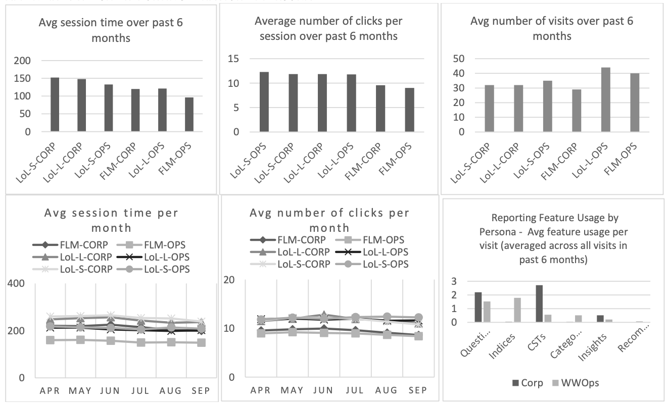
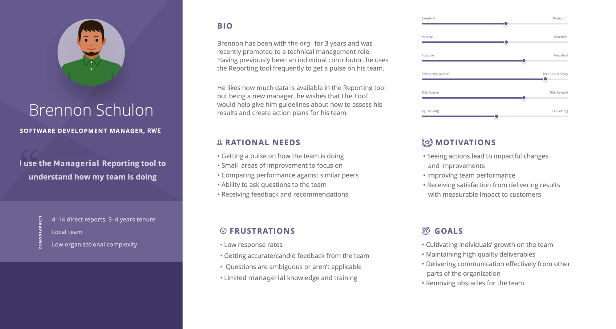
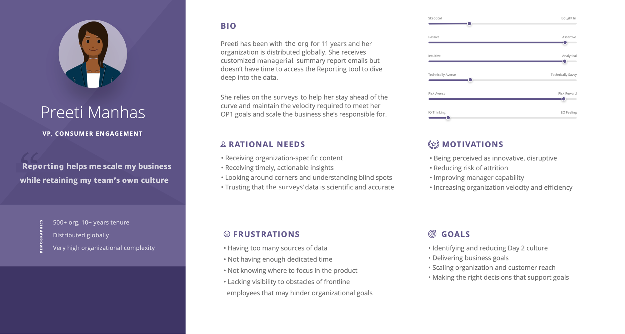
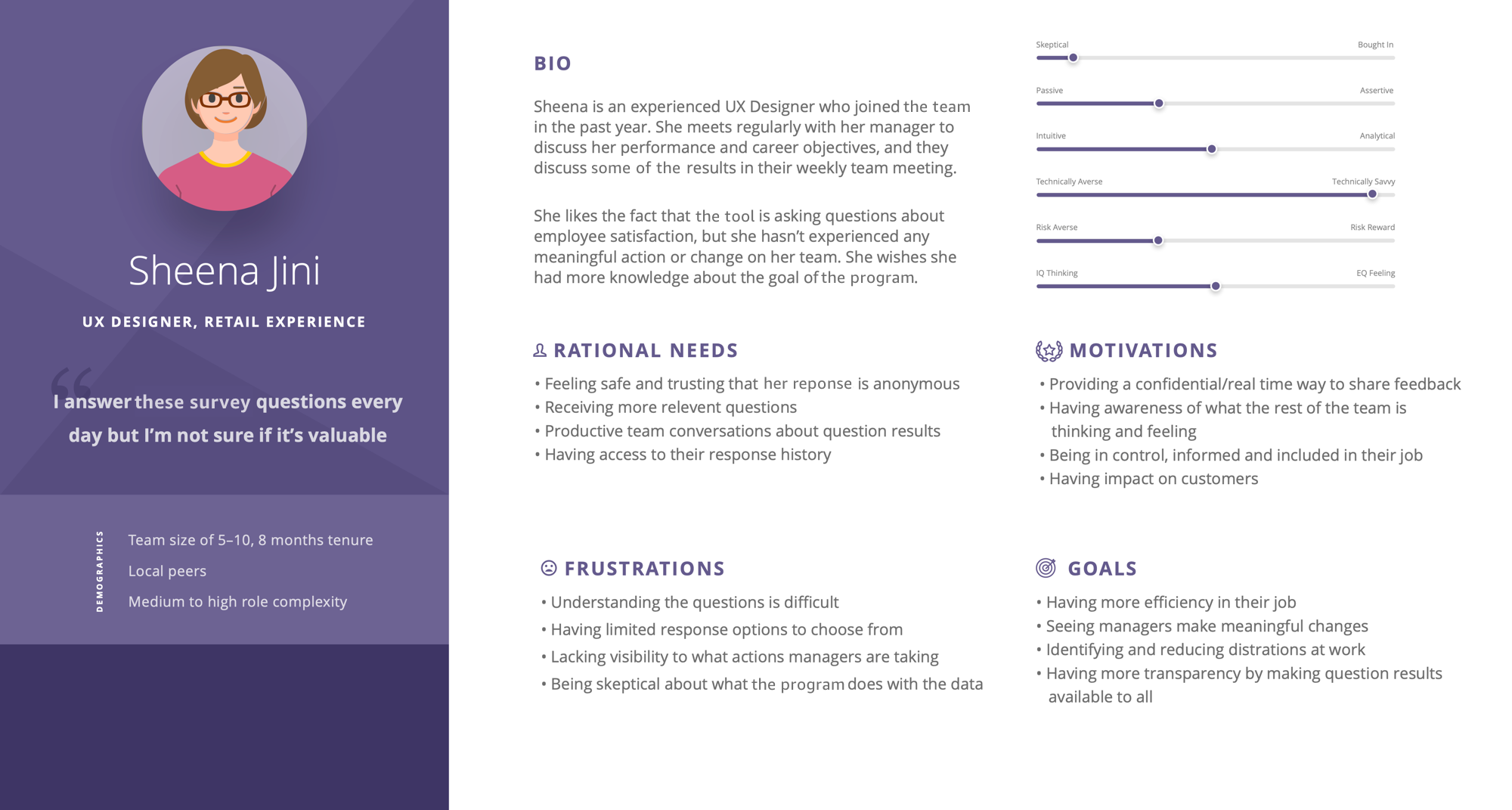
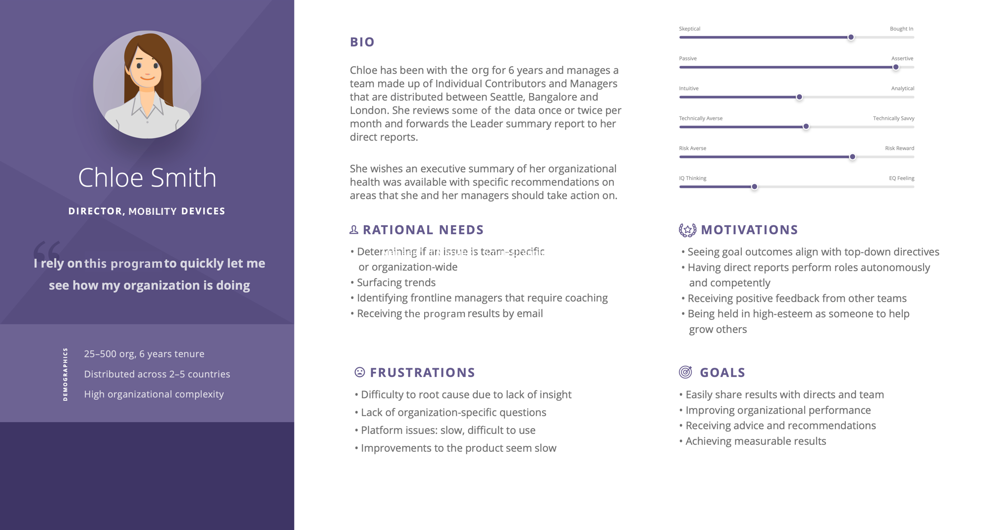
It was time to take a step back, and re-evaluate what our users truly need. A combination of Qualtrics surveys, internal survey results, and quantitative/qualitative research helped us understand our 4 key personas.
The design process
I was armed with a strong understanding of the common pain points, goals, and motivations that our leaders expressed to us. Working very closely with Product, Tech, Data Science/Research and Business Partners, we began defining the direction of the future vision of this product. It was easy to dismiss the existing usability issues since we were focused on generating concepts, but they also served a reminder as to how our users interacted with the tool, and bring that knowledge to the new design.
How might we create a simplified reporting experience that helps our leaders identify key insights, and receive clear recommendations so that they can take action on them?
These design explorations helped inform the Product brief that would need to be signed off in order for this project to be given tech resources and leadership support. It helped us unearth key questions, like, “what level of fidelity do we truly need in peer benchmarking scores”, and “what are the criteria for elevating insights to a leader of 1500+ employees”?
Daily whiteboarding, sketching, and brainstorming sessions made this design a truly collaborative effort. Product had very specific ideas of what they wanted the Product to be, and I was able to inject valuable insights from the user research to help them re-evaluate their convictions.
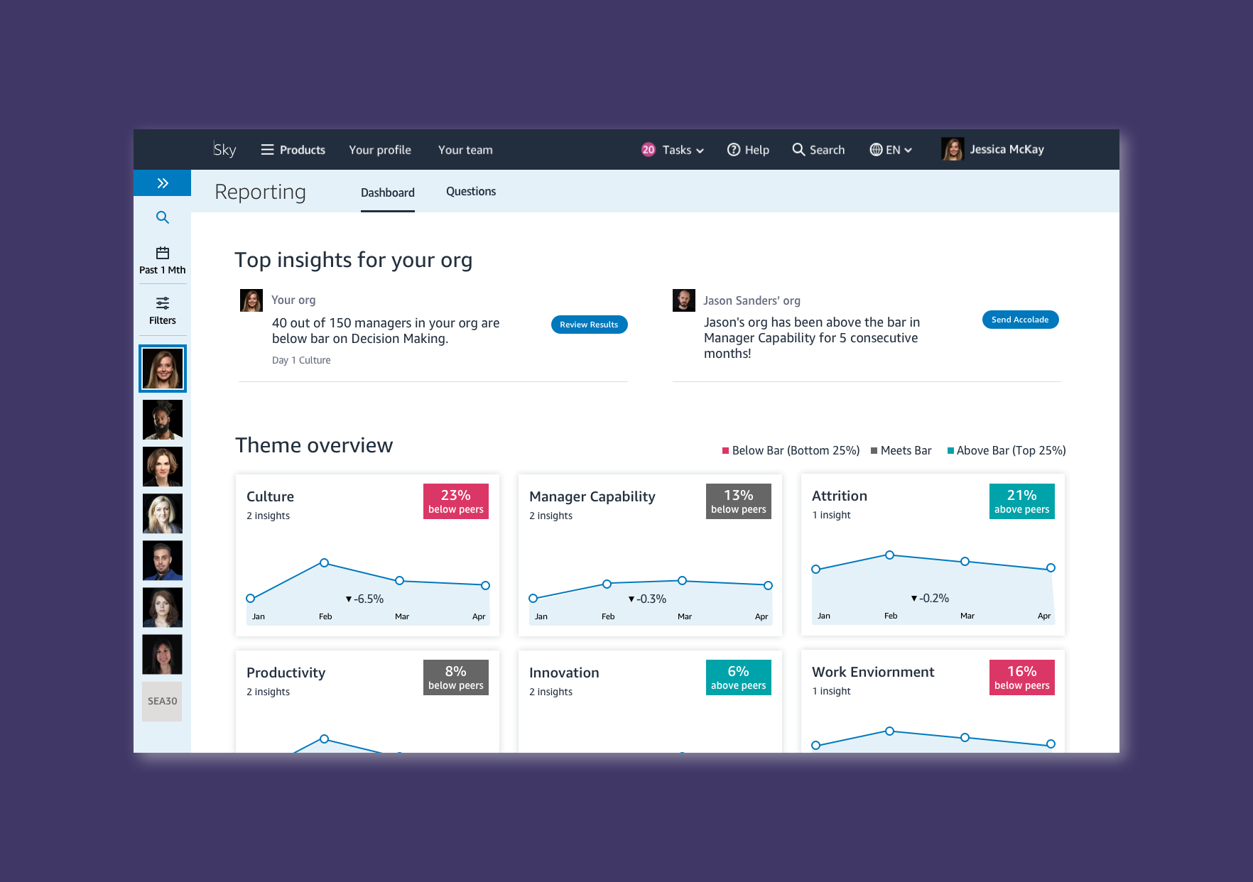
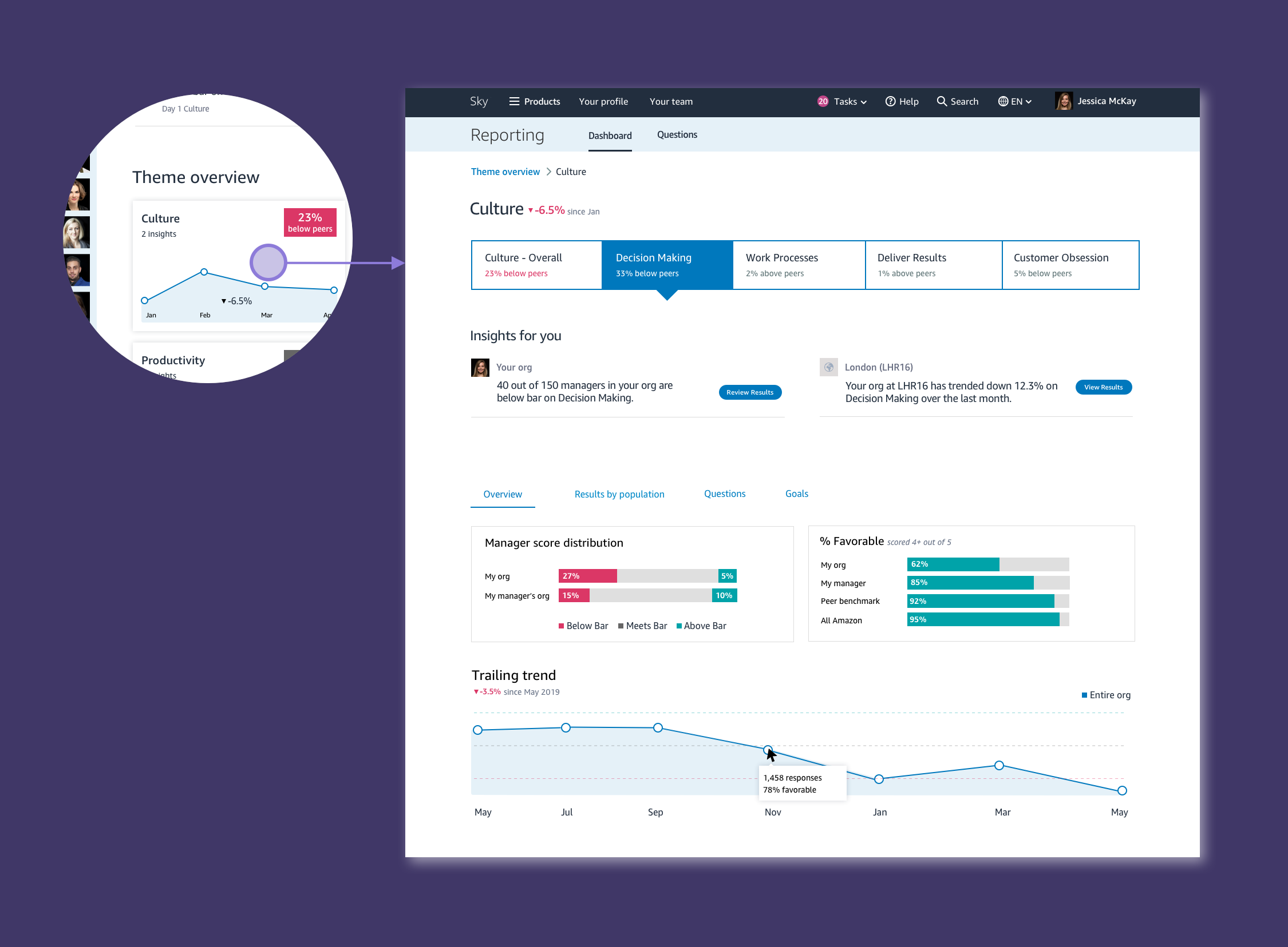
A purposeful Dashboard solution
To ensure insights are not lost in detail pages, we elevate the most important insights on the Dashboard. We wanted leaders to feel confident that if there were no insights surfaced on the Dashboard, that they can leave right then and there. Time is of utmost importance.
The data science and research team has been working in parallel to come up with an improved model where we can group questions into themes that are not simply just categorizations, but rather science-based inferences that we can make based on the behaviours and outcomes that the ML models identify. Themes also drastically simplify the user experience. Now, instead of viewing a large list of questions, leaders can quickly review which themes require their attention, and ignore the ones that are not a priority for them.
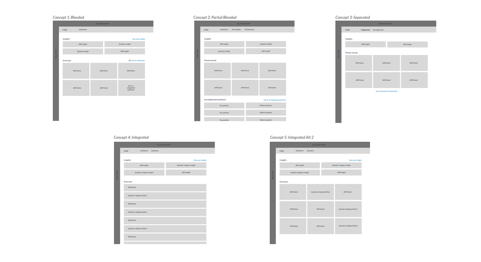
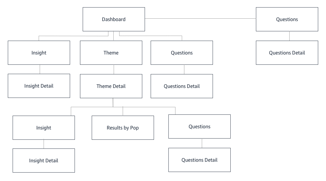
Improved information architecture and flow
The existing experience was difficult to navigate, and content was organized illogically. In the new information architecture, users can quickly glance at all the themes, determine which one is of interest, and deep dive on the Theme Overview page, where they can drill down into a sub-nav that provides additional, but less pertinent information.
A second look at Scoring
In the previous experience, users are given a score out of 5 (based on the Likert scale), on how they performed on each question. We found that managers were constantly fixating on whether their score was going up or down, even if it was by a decimal point. The behaviour we wanted to drive was improvement, not fixation on performance. We decided to simplify scoring by distilling it down to a peer benchmark measure of “Below”, “At”, and “Above” Peers. This allows managers to compare their performance against other peers, without fixating on a numerical score value.
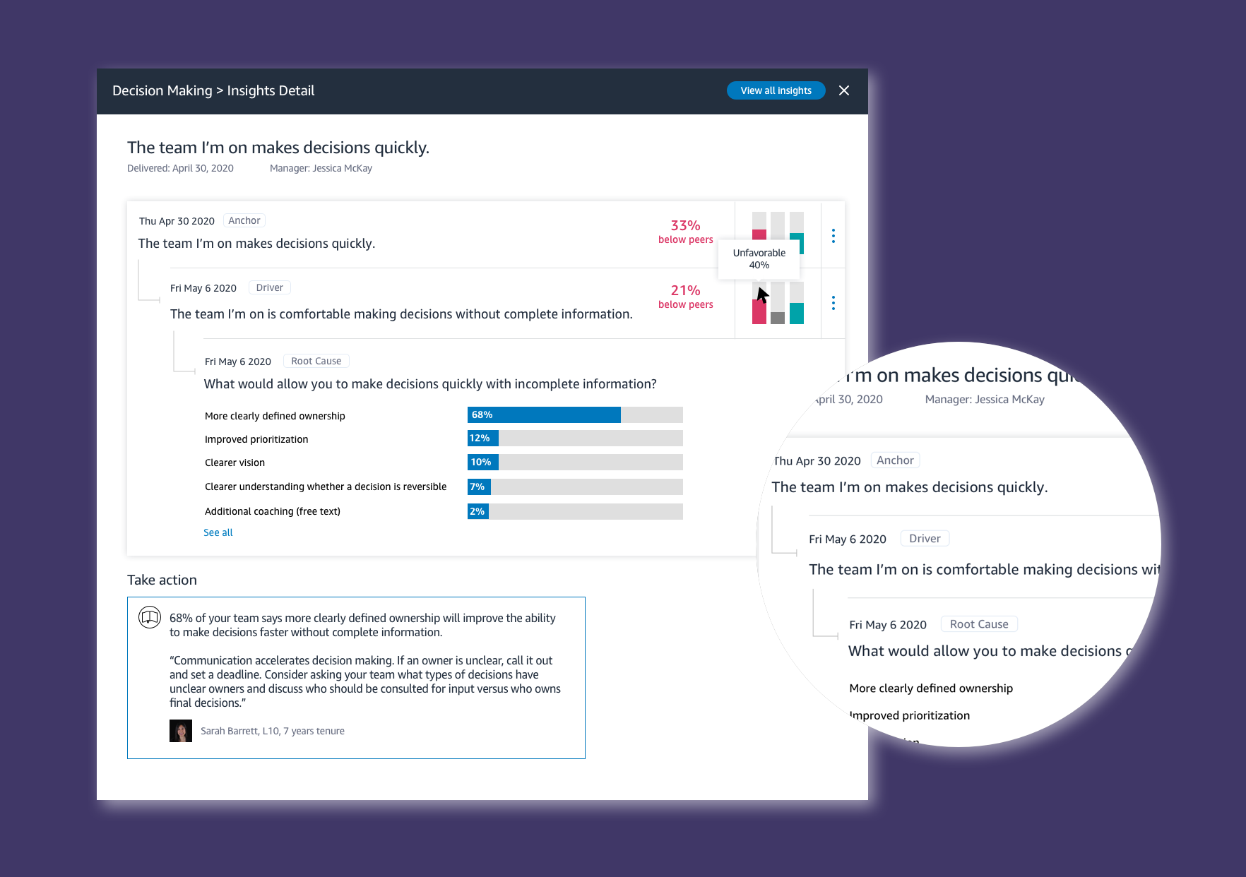
ML driven content
A leader will see that an Anchor question was asked, the purpose of which is to determine if there might be an issue in any given area. If the scores come back lower than expected, a follow up Driver question is asked, which helps refine where the problem might be. Lastly, the Root cause question is delivered, so that we can help leaders identify the solution. This improved ML model ensures that we are giving leaders accurate, and actionable results - the most pertinent goal for our users.
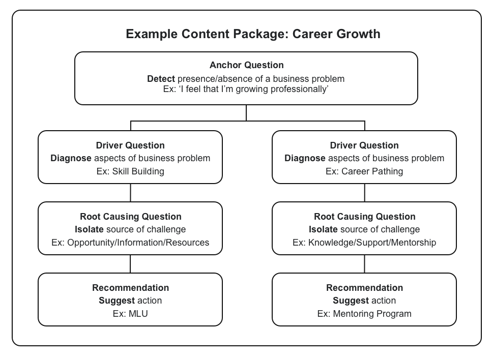
Expert and crowd sourced recommendations
The root cause questions will provide ways to improve the problem, but we also have mechanisms for leaders to provide tips and advice on specific questions. These are rated by the community, and featured based on their effectiveness.
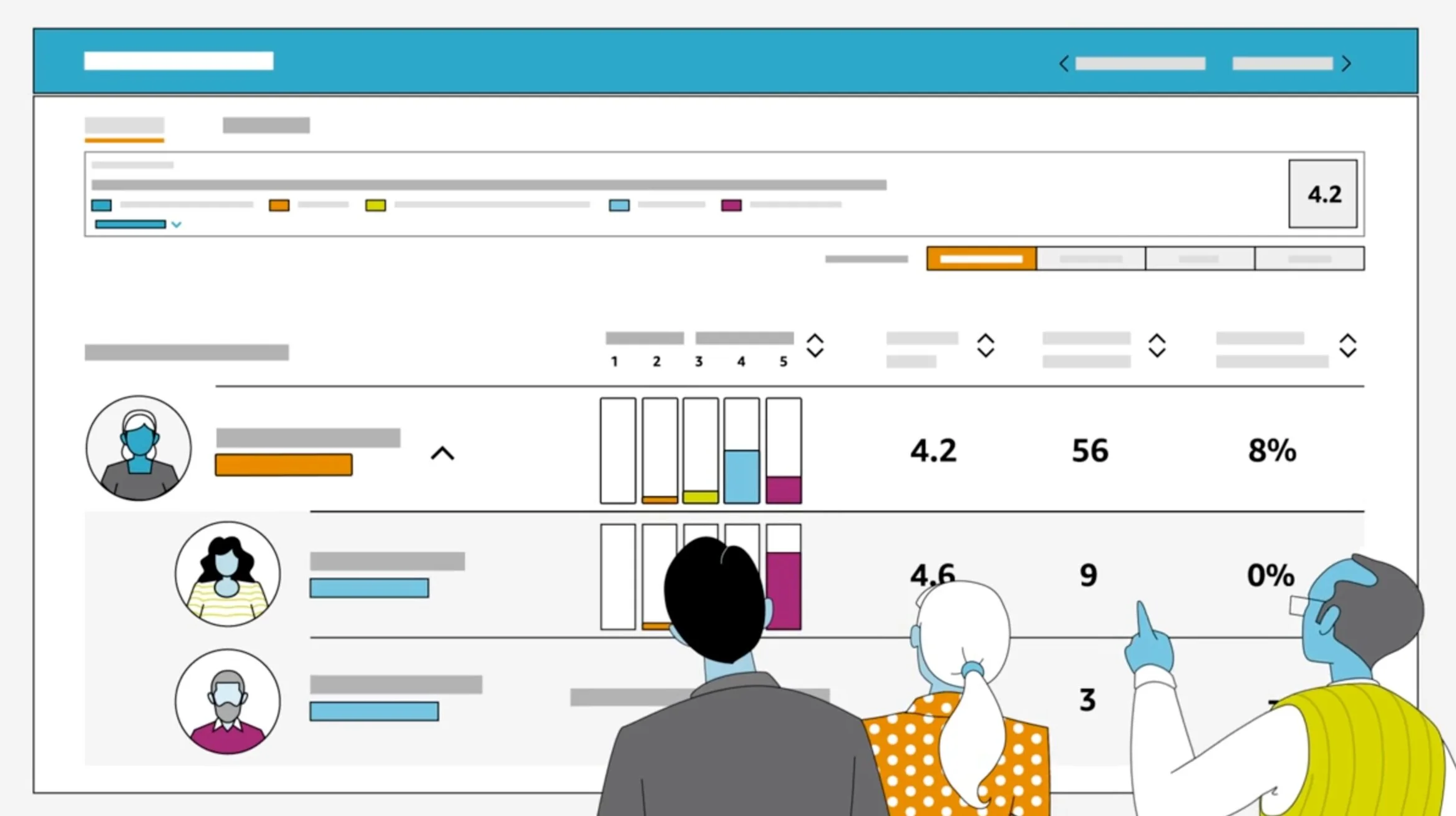
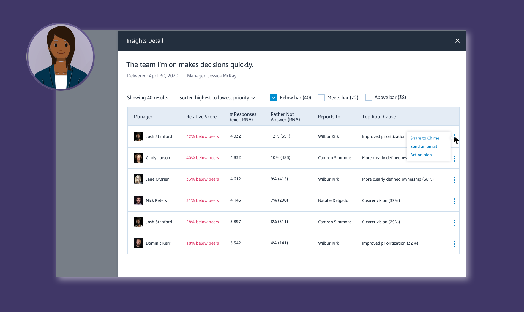
A birds eye view
Leaders of leaders of large organizations have different goals than those of frontline managers, or those of smaller organizations. They need a birds eye view of how all the managers in the org are doing, and to be able to quickly identify the most pressing areas of concern. These users receive different cuts of data, to give them insights that are meaningful to them.
Outcomes
At this stage of the project, our primary aim was to gain goal and feature alignment with the SVP of Human Resources, and respective leadership teams under the org. As the Lead UX Designer, I developed the strategy and content of the brief with the Product Lead, and provided mocks and walkthroughs of the design proposal. The reaction was more than expected - we were given the green light to proceed with the re-haul. Following this, the design was launched in Beta, and is now in plans to take over the current experience to 100% dial up as the reception has been overwhelmingly positive.