Non-Profit Web Re-Design
This web re-design was for a non-profit organization aimed to help people access affordable prescription medication. The team came to us feeling overwhelmed with the number of issues they were experiencing with the site, and wanted our help to determine the right strategy, and process improvements. Due to confidentiality purposes, the client name and other details are omitted here.
My Role
Lead UX Designer & User Researcher
Client Goal
We met with the clients to understand what they wanted to achieve through their organization. Their mission was clear: help those in need get access to affordable medications. Digging deeper, we learned that there were obstacles to that goal, that were causing frustrations throughout the organization and were hindering the process.
UX Goal
Create a user experience that eliminates confusion and barriers around the application process, and helps the user feel confident and at ease throughout the process.
User Research
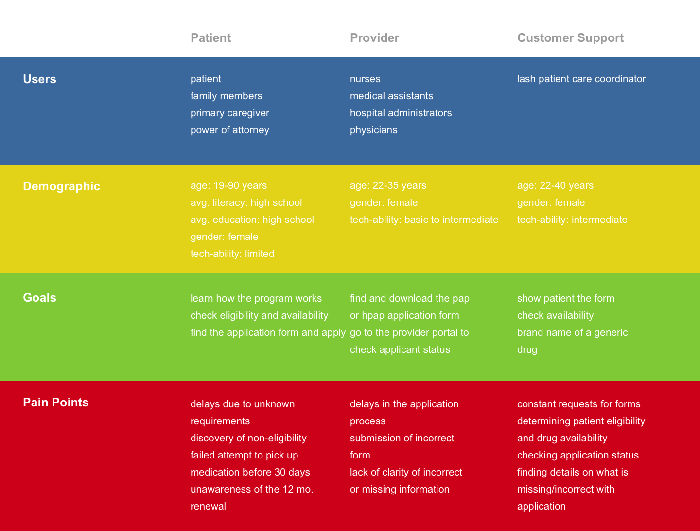
After the kick-off, we dived straight into user research. This was the longest stent in the design process, and rightly so! We had to understand their goals, needs, and pain points. We relied on the knowledge of our stakeholders (which we designated as SME's) as well as in-depth interviews with Customer Support staff, focusing on 3 primary user types. After hours of interviews, we unearthed a much better understanding of who we were designing for.
Understanding the Application Process
I focused some time getting familiar with the application process. I felt it was imperative to offer the client some insights as to how to optimize it, and what people generally go through when dealing with the application process. This was also an important activity as one of the UX Goals was to help people through this as easily as possible. Some solutions based on the findings include:
Increase visibility of the application form
Reduce content in an easily digestible format
Clarify misleading processes such as the ‘Apply by Phone’
Correctly define application requirements (ex. medical reports, tax forms, insurance letters, etc.)
Increase visibility and importance of the application checklist
Alternative options: calculator, or online application
“I’ve never realized what an applicant actually goes through from beginning to end. It brings a whole new meaning to this project, and motivates me even more to make this work”
Heuristic Analysis
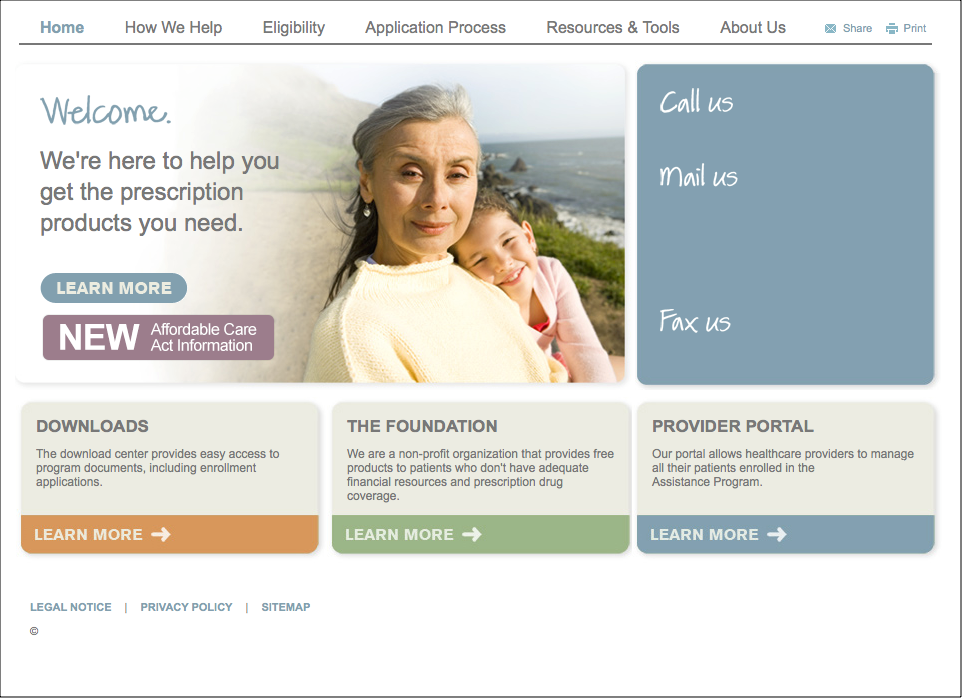
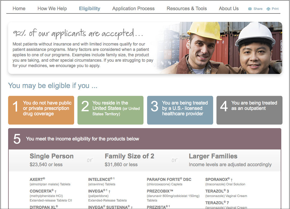
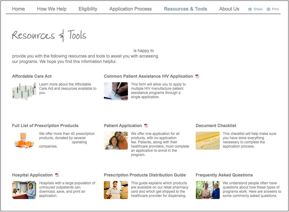
The current website was audited from top to bottom. I looked at content, information architecture, user pathways, and potential usability issues. Ultimately, I wanted to know what we were working with, and what new content or information we would need. This is what the site looked like before:
Solving User Problems
Problem 1
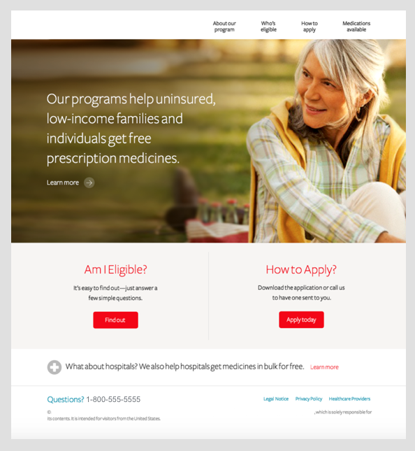
I, the user, feel overwhelmed with all the site has to offer, and don't know where to begin.
We determined that the vast majority of site visits by patients were comprised of 2 main goals. Presenting easy access to accomplish both, became the main focal point of the Homepage.
Problem 2
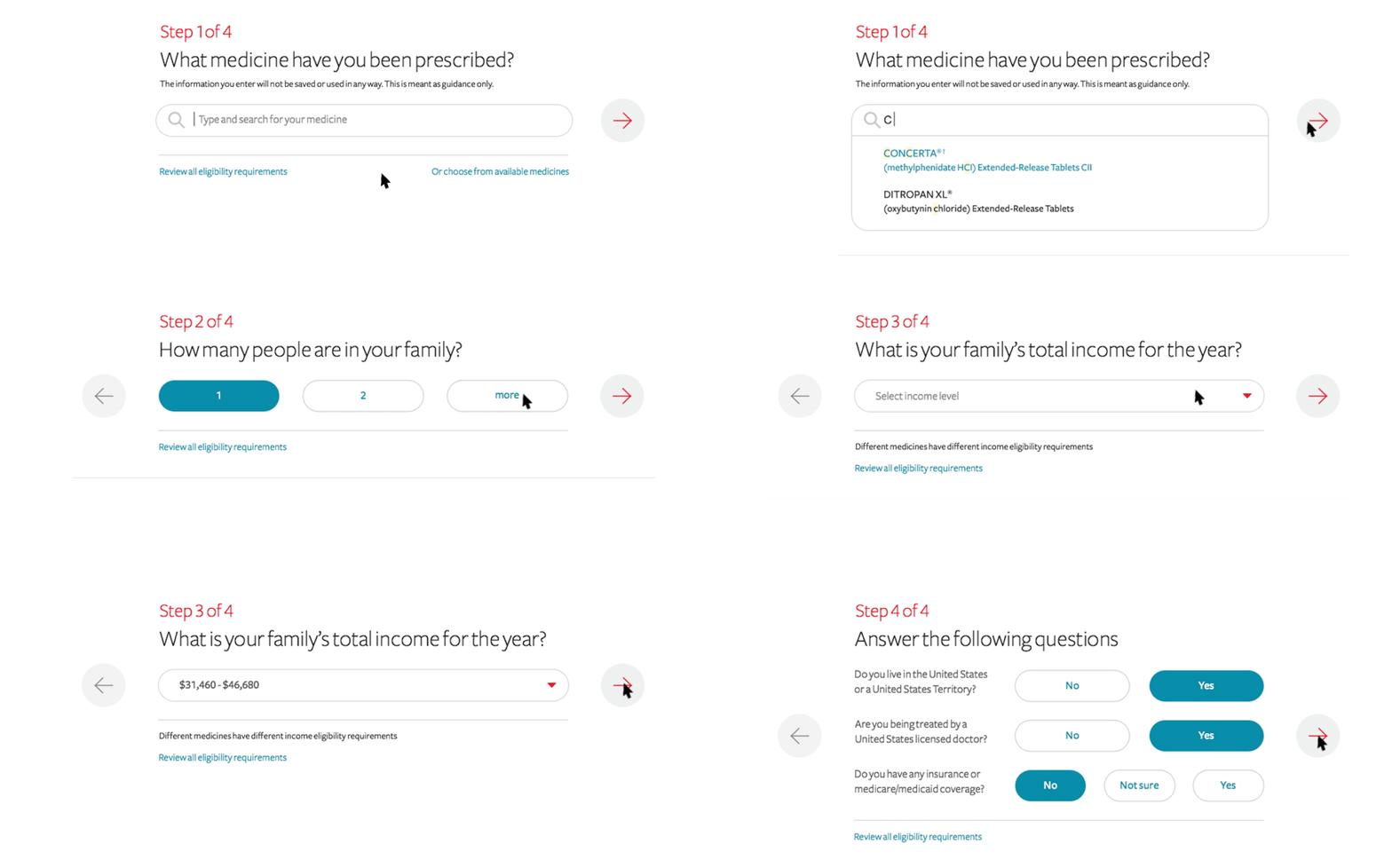
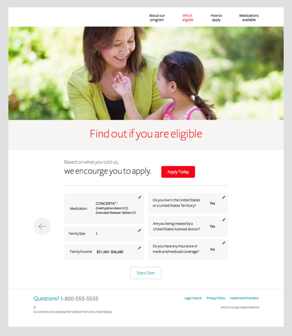
I, the user, do not understand whether I am even eligible to participate in this program.
After looking at how comparable sites handled this problem, we decided ultimately to move forward with designing an Eligibility Calculator.
Problem 3
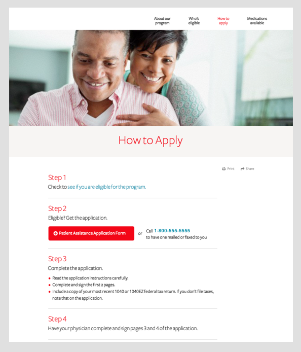
I, the user, do not understand how the application process works.
I really had to flex my copy writing skills here. Our SME's recommended we use language at a Grade 3 reading level. Simplifying the language reduced confusion, and visual hierarchy helps the user follow along.
UX Solutions
After conducting User Research and understanding the client's goals and needs, we determined that the UX strategy needed to accomplish the following:
Deliver content in a clear, direct, and easy to digest manner
Help people understand if they’re eligible in the fastest, simplest way possible
Streamlined application form & process
Reflections
I came away from this project with two major learnings. The first, is that taking the time needed to understand the problems that exist, and who you're designing for is paramount. No amount of creative thinking or design skills can make up for the lack of understanding of your users. The second, is that the team you work with can not only make the design process fun and energetic, but also, can positively impact the outcome in immeasurable ways. The team is dedicated, passionate, and so knowledgable, and I think fondly of every session we had together.

