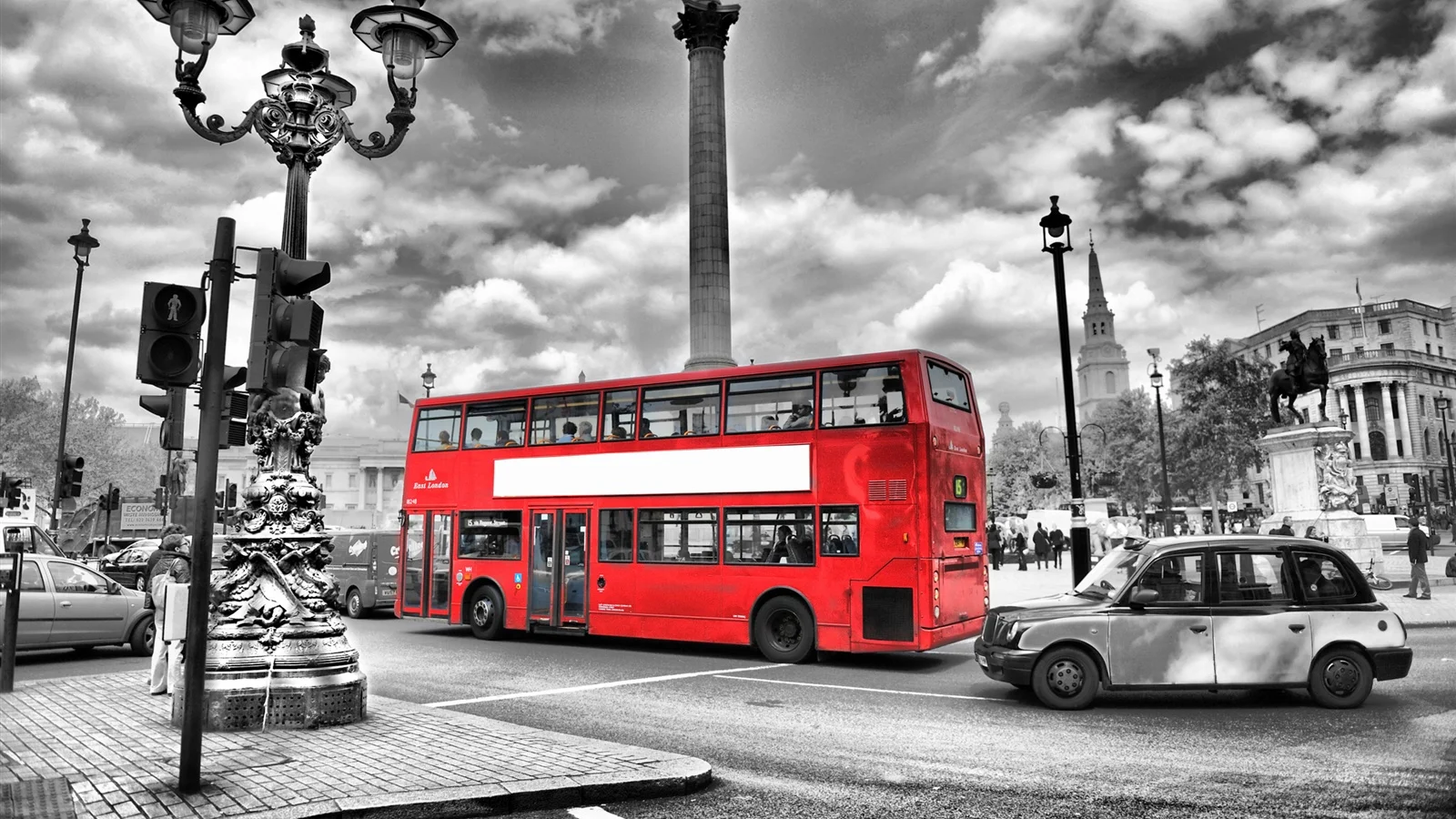
I've never been to London England before. Sure, there's a London in Ontario, but it's certainly not as large, or glamorous (though it is very quaint!). When I picture London, I see a mass of people crowded in the Tube, or jam packed in their cars on their way to work. Interestingly, in London, there are roads called Red Routes, which have painted red lines on them that distinguish them as 'critical' roads that must be kept clear at all times in order for transport to function decently. You can think of them kind of like the main arteries in your body - crucial delivery paths that transport much needed resources throughout your body.
Applying the London example, user experience designers utilize something called the Red Route method when designing websites and applications. Rather than trying to accomplish everything, critical 'Red Routes' are identified, and delivered as the 'main arteries of the website'. They represent the key functions that the user, and the business owner want to accomplish.
So why do designers use Red Routes exactly? Here are some reasons:
Reason #1: A Red Route approach allows you to avoid the problem of trying to understand everything that everyone wants to do, by focusing on the most important scenarios enacted by the key Personas. Just like in London, Red Routes established for websites and applications allow the design team to keep focus on the critical user tasks at hand.
Reason #2: A Red Route approach involves creating a map of the user's path to a goal, which in hand shows us where to look for roadblocks along the way. Gaps and issues can be quickly located to specific Red Routes, whereby they can then be resolved.
Reason #3: if you don't focus on red routes, you run of the risk of causing issues with the site's Information Architecture. Each page you add on to the website requires more navigation links, which leads to more 'noise' in the site's navigation, making it more difficult for users to find the content they need. Simply put, less is more. Crucial features only please :)
Reason #4, if you don't focus on red routes, site maintenance increases.
There are many ways you can identify the Red Routes of your application and website. For example, you can examine competitor sites, use a survey, identify frequent tasks, identify critical tasks, and ask users to pick their top 5 tasks. Essentially, when picking red routes, ensure that most or all of the people will be taking them, most or all of the time.
Case Example: Red Routes for a university website:
- What subjects are available to study at the university?
- How much is annual tuition for a domestic/international student?
- Where is the location of the campus?
- Are part-time studies an option?
- What are the admission requirements for each program?
Importantly, people approach tasks differently based on the context of use. A student, professor, and school administrator will carry out tasks on a School website differently from each other. Thus, we have to understand the context. Context is built into tasks with user stories, which are based on a specific Persona.
For example, one red route on a Health application may be "Manage my eczema". Here is a user story of Anna. Anna says, "As someone with eczema, I want to track my skin condition on the computer so I can find out any specific periods of the day, month or year where my skin is most troubled".
Once you have your user stories, it's always a good idea to test them to ensure they are sound and accurate. Here are some questions you can ask to test your user story:
1. Is it really a red route?
2. Is it specific and measurable?
3. Does it describe a complete activity?
4. Does it describe what the user wants to do (not how it's done)?
So before designing any website or application, keep in mind what the red routes are that capture your users' key goals when using your app.